
Managing tutorial samples
This article documents the process of creating and managing the content described in the section 4. Application Developer tutorials from the Aurelia KendoUI Bridge Documentation
In order to ensure the best possible syncronization between the Aurelia's skeleton navigation samples used as the basis for KendoUI bridge's own (parallel) set of KendoUI tutorials code, the information in 4. Application Developer tutorials describes the process of modifying Aurelia samples to be able to use KendoUI bridge.
This article explains the creation and management of the kendoui-tutorials-code repository which contains the finished code for samples as tutorials in the section 4. Application Developer tutorials. The process is very similar for all entries in kendoui-tutorials-code repository:
Step 1
Copy the code of the original navigation skeleton sample from skeleton-navigation sample to kendoui-tutorials-code
Step 2
Transform the original code in just the created kendoui-tutorials-code repository to add all changes needed to make this sample use KendoUI bridge.
The specifics of each transformation are described on the following pages:
2 KendoUI-skeleton-esnext-aspnetcore
3. KendoUI-skeleton-esnext-webpack
4. KendoUI-skeleton-typescript
5. KendoUI-skeleton-typescript-aspnetcore
6. KendoUI-skeleton-typescript-webpack
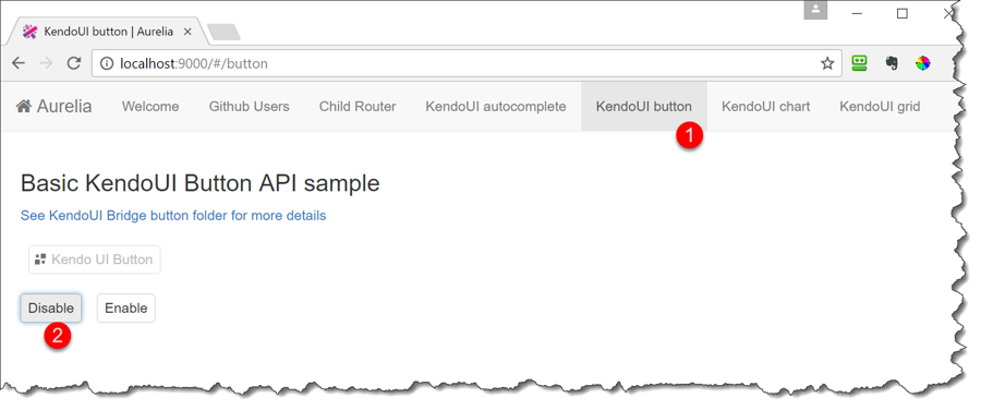
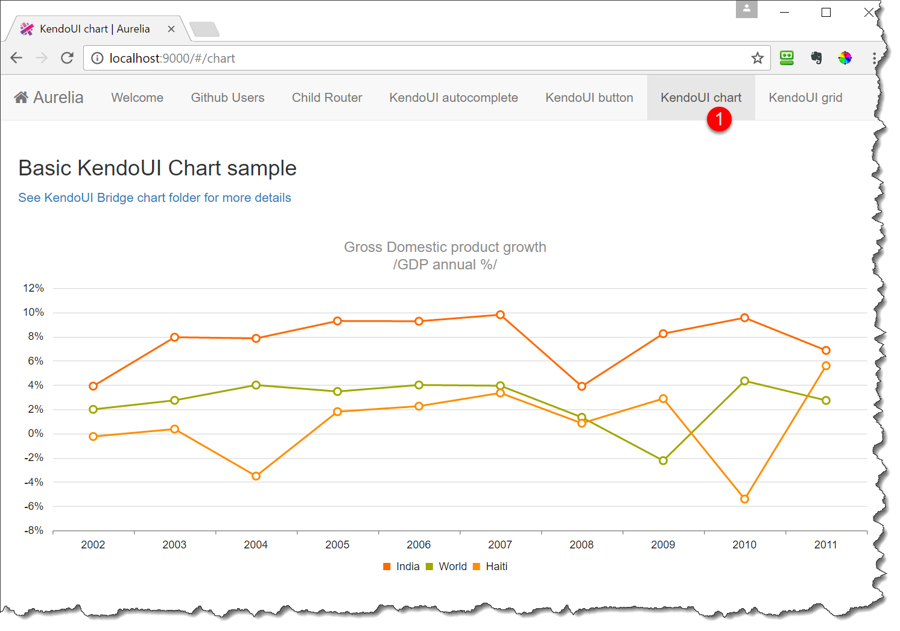
Each of the above pages shows what needs to be changed in order to add four additional tabs which render Aurelia KendoUI components. The first two use the KendoUI core widgets, while the second two use subscription based KendoUI Pro package.


Last updated