
1.3 Components catalog
Catalog of Materialize controls as Aurelia components.
This is the most likely fashion this application is being used. Invoked via URL: http://aurelia-ui-toolkits.github.io/demo-materialize/ the application renders the view shown below, which shows an overview of components provided by this bridge.
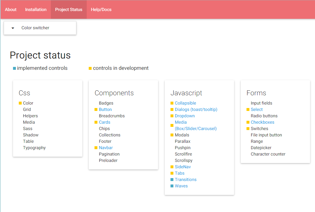
Image 1
2.1 Browsing the catalog
The click on Project status menu item (as shown on Image 1 above) results in showing the Aurelia Materialize bridge components overview. Clicking on one of the components, a sample page is shown, containing a basic use example and more insteresting options along with a side-nav navigation on the left edge, showing the other available components.
That side-nav mimics the side-nav of Materialize website to be easy recognizable by Materialize users.
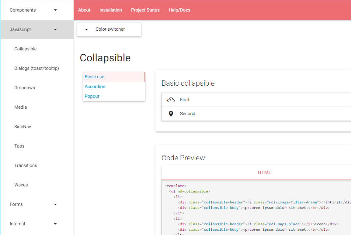
Image 2
Selecting the Collapsible side-nav item, results with the view of the collapsible page of this catalog (as shown above).
Note the additional sidebar offering implementation options for the current component.
2.2 Browsing the catalog's code sections
Each of the page showing a Materialize control converted to an Aurelia component, has a section that shows the usage of the component (the consumer's view) along with optional view model and css options.
Here are three consecutive screen-shots showing that information for the select control.
Select view
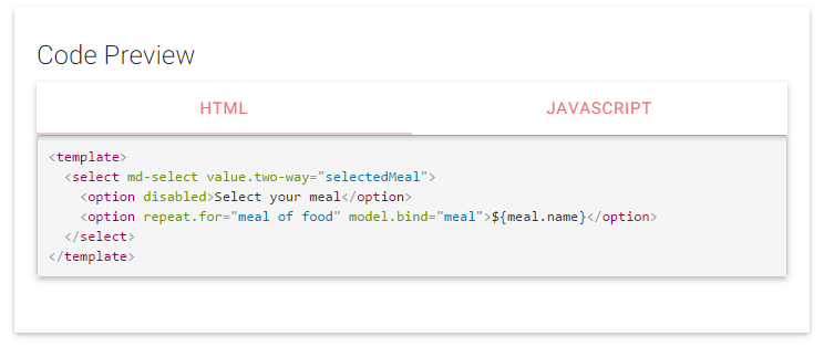
Image 5 **Select view model**
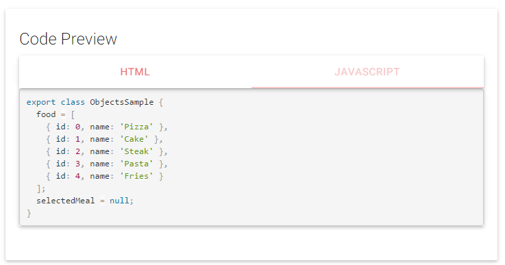
Image 6 **Waves CSS**
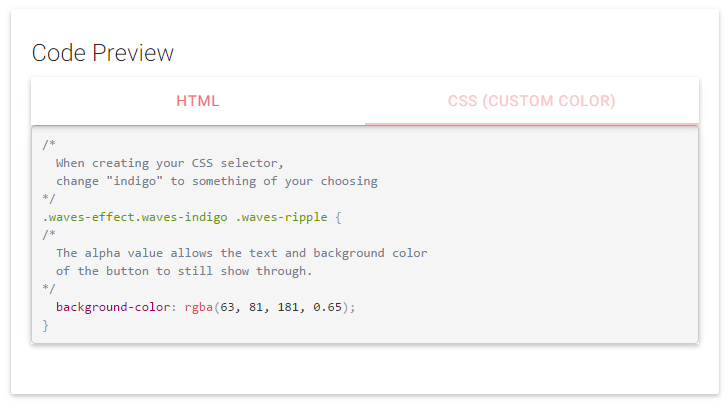
Image 7
Last updated