
1.4 Internal Structure
This article presents the overview of the internal organization of the Aurelia-Materialize-Bridge project developed by the team of Aurelia UI Toolkits organization, dedicated to help Aurelia's wide spread adoption .
The internal organization of this bridge is slightly different than Aurelia's standard plugin. We believe that it is more convenient. Image 1 below, shows the overall structure.
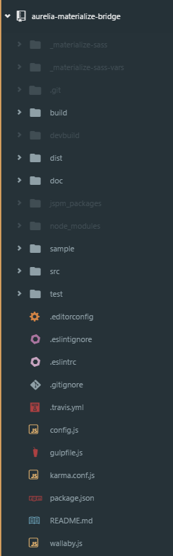
Image 1
The following three sections describe the details of the plugin structure and building process
3.1 Plugin code
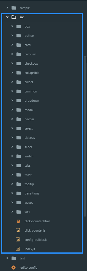
Image 2
The plugin's src folder contains the common subfolder with utilities used by more than one Materialize component "wrapped" by this plugin. In addition to the just described utility of the common folder, the src folder contains a subfolder for each of the Materialize components that is wrapped by this plugin.
Note: At the time of writing this, not all components have been implemented. There are more available than this screenshot shows.
The code in the plugin defines its content via the config-builder.js file
File config-builder.js
config-builder.jsNote that this file defines the controls that are available to Aurelia developers at the time of writing this article.
Let's also show the actual Aurelia plugin implementation of one of the simplest Materialize controls - switch
File switch.js
switch.js3.2 Sample Application that acts as the Plugin consumer
As mentioned before Aurelia-Materialize-Bridge has a special structure, with the plugin consumer application being a part of the same project (see the content of the blue rectangle on the image 3 below)
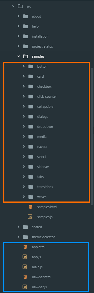
Image 3 #### Color codes: * **orange**: Materialize controls hosted by this sample app (these controls are the consumers of the Aurelia-Materialize-Bridge) * **blueish**: Standard Aurelia application files collection #### Sample application showing the Materialize Button control:
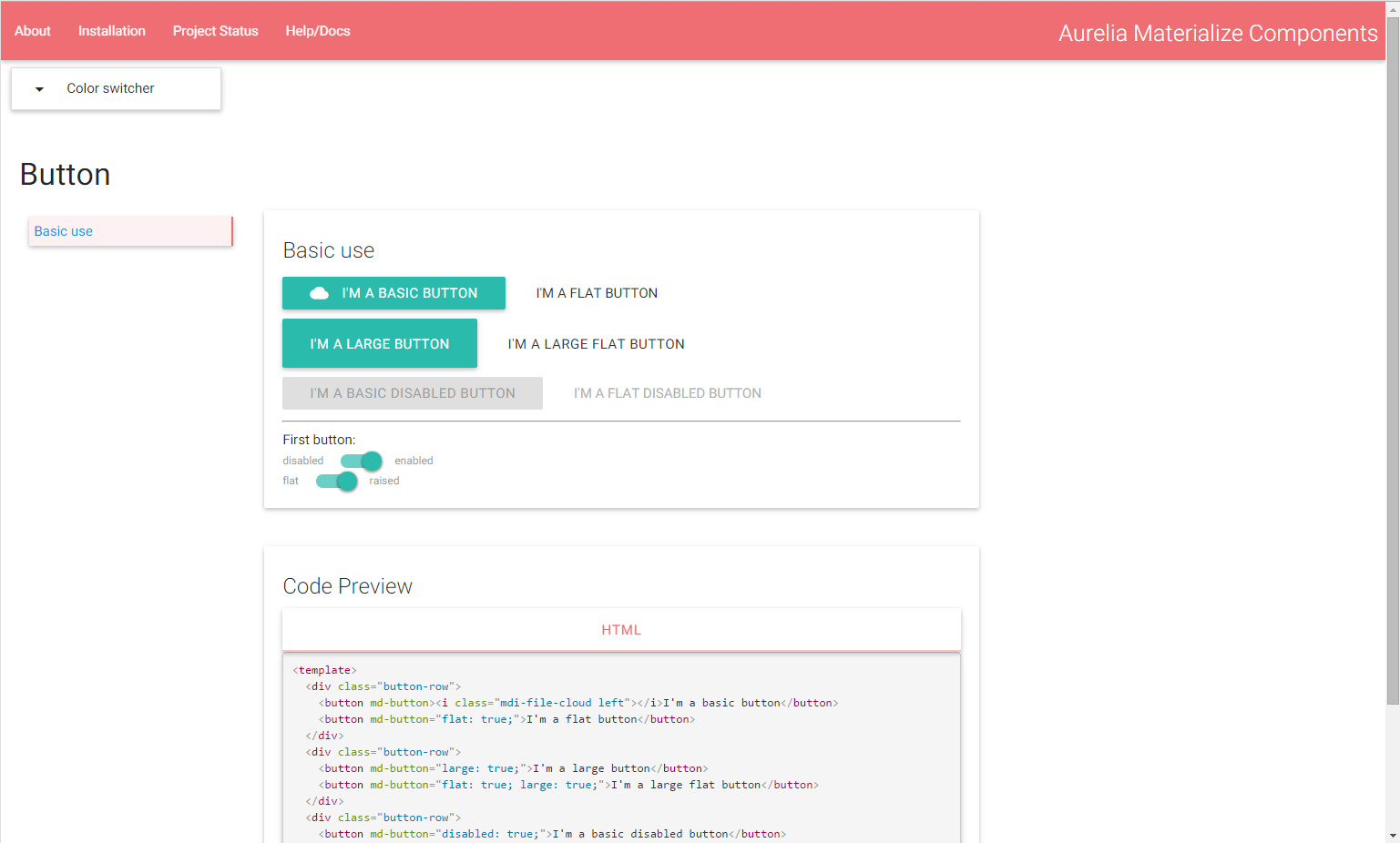
Image 4
Last updated