
Components catalog
About this application
1.3 Catalog of Aurelia KendoUI components.
The Components Catalog is the most often used section of this app. It renders the default view (shown below as Image 1), specifically chosen to point out the "widget auto initialization" issue, which is a very frequent subject of discussion in Aurelia KendoUI chat room
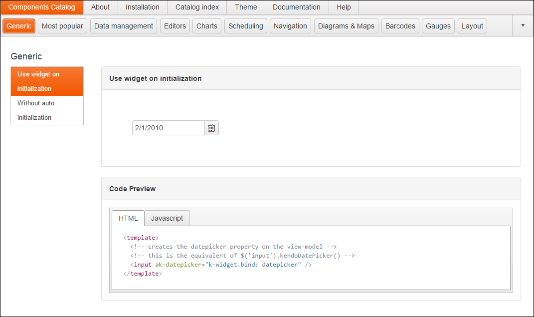
Image 1
2.1 Browsing the catalog
The click on Components Catalog menu item (left-most, shown on Image 1 above), followed by the click on Most popular and click on Grid button results with the Aurelia KendoUI Controls Catalog rendering the KendoUI basic grid sample. In addition to rendering the grid, the Aurelia KendoUI Controls Catalog also shows the Samples Toolbar, which shows all categories of controls, with the GENERIC category being select as default.
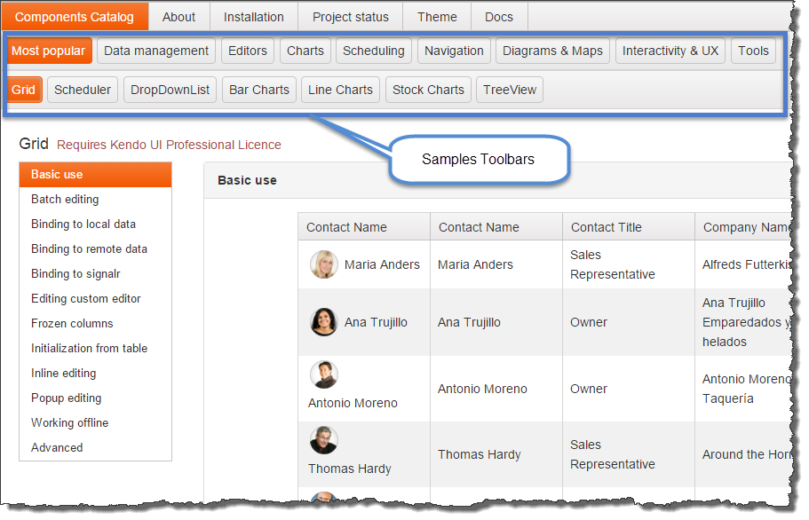
Image 2
Selecting other items from the Samples Toolbar will result with the appearance of the second instance of the Samples Toolbar, right beneath the first one. Here is the the screenshot of the application state if the MOST POPULAR toolbar item is selected:
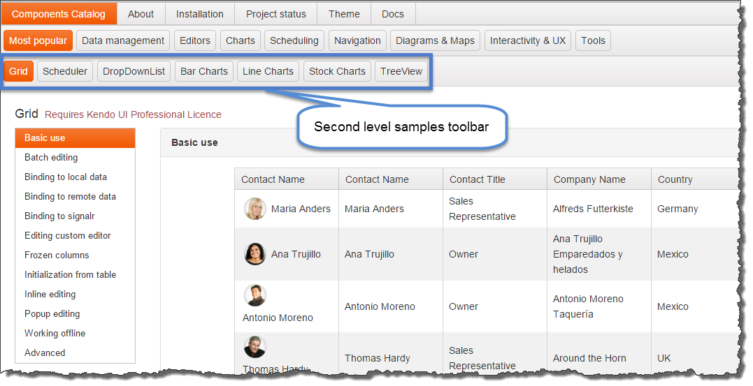
Image 3
Finally, selecting the STOCK CHARTS toolbar item, results with the the view of the stock charts page of this catalog:
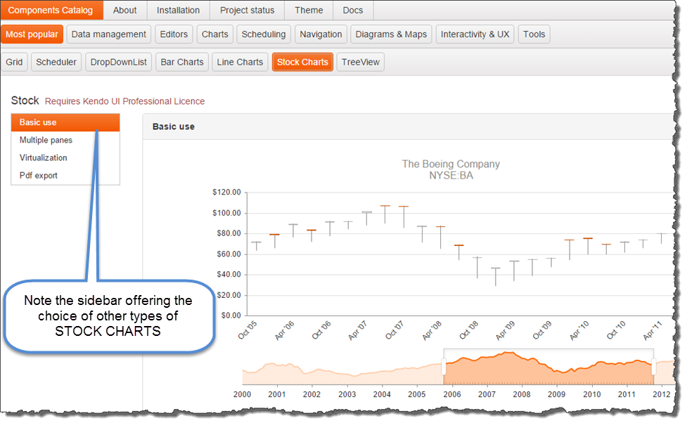
Image 4
2.2 Browsing the catalog's code sections
Each of the page showing a KendoUI control converted to an Aurelia component, has the section that shows the component's view and view model. Here are three consecutive screen-shots showing that information for the Sample grid control on Image 1 above.
Grid view
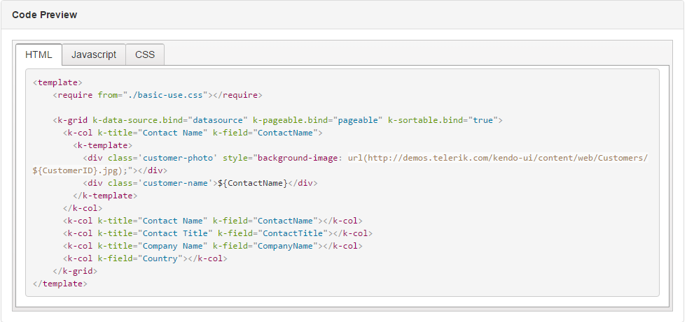
Image 5
Grid view model
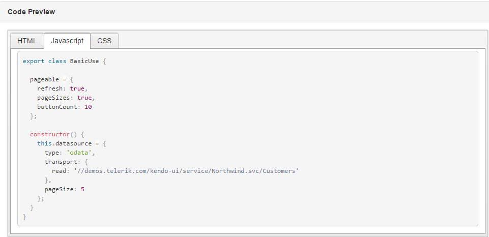
Image 6
Private CSS file
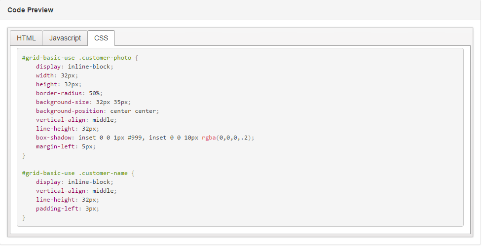
Image 7
Last updated