
typescript - kendo
typescript kendo
Summary
Details
npm install && jspm install && gulp watch jspm install css npm:@progress/kendo-ui aurelia-kendoui-bridge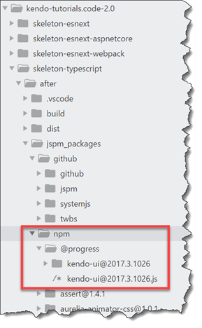
Important note
Last updated
npm install && jspm install && gulp watch jspm install css npm:@progress/kendo-ui aurelia-kendoui-bridgeLast updated
    paths: {
    "github:*": "jspm_packages/github/*",
    "npm:*": "jspm_packages/npm/*",
    "kendo.*": "jspm_packages/github/npm/progress/kendo-ui@2017.3.1026/js/kendo.*.js",
    "kendo-ui/*": "jspm_packages/npm/@progress/kendo-ui@2017.3.1026/*"
}, npm install @types/kendo-ui typings install kendo-ui --source=dt --globalimport 'kendo-ui/js/kendo.autocomplete.min';
export class autocomplete{
private datasource: kendo.data.DataSource;
constructor() {
this.datasource = new kendo.data.DataSource({
transport: {
read: {
dataType: 'jsonp',
url: '//demos.telerik.com/kendo-ui/service/Customers'
}
}
});
}
}template>
<require from="aurelia-kendoui-bridge/autocomplete/autocomplete"></require>
<require from="aurelia-kendoui-bridge/common/template"></require>
<require from="kendo-ui/css/web/kendo.common.min.css!"></require>
<require from="kendo-ui/css/web/kendo.bootstrap.min.css!"></require>
<require from="./autocomplete.css"></require>
<div id="example" style="margin-top: 20px; margin-left: 20px">
<div class="demo-section k-content">
<p><strong>Customers:</strong></p>
<ak-autocomplete k-data-source.bind="datasource"
k-height.bind="400"
k-min-length.bind="1"
k-data-text-field="ContactName">
<ak-template>
<span class="k-state-default" style="background-image: url('http://demos.telerik.com/kendo-ui/content/web/Customers/${CustomerID}.jpg')"></span>
<span class="k-state-default"><h3>${ContactName}</h3><p>${CompanyName}</p></span>
</ak-template>
<ak-template for='headerTemplate'>
<div class="dropdown-header k-widget k-header">
<span>Photo</span>
<span>Contact info</span>
</div>
</ak-template>
<input id="autocomplete-customizing-templates-customers" style="width: 50%"/>
</ak-autocomplete>
<p class="demo-hint">Start typing to find a customer. E.g. "Ann" </p>
</div>
</div>
</template> .dropdown-header {
border-width: 0 0 1px 0;
text-transform: uppercase;
}
.dropdown-header > span {
display: inline-block;
padding: 10px;
}
.dropdown-header > span:first-child {
width: 50px;
}
.k-item {
line-height: 1em;
min-width: 300px;
}
/* Material Theme padding adjustment*/
.k-material .k-item,
.k-material .k-item.k-state-hover,
.k-materialblack .k-item,
.k-materialblack .k-item.k-state-hover {
padding-left: 5px;
border-left: 0;
}
.k-item > span {
-webkit-box-sizing: border-box;
-moz-box-sizing: border-box;
box-sizing: border-box;
display: inline-block;
vertical-align: top;
margin: 20px 10px 10px 5px;
}
.k-item > span:first-child {
-moz-box-shadow: inset 0 0 30px rgba(0,0,0,.3);
-webkit-box-shadow: inset 0 0 30px rgba(0,0,0,.3);
box-shadow: inset 0 0 30px rgba(0,0,0,.3);
margin: 10px;
width: 50px;
height: 50px;
border-radius: 50%;
background-size: 100%;
background-repeat: no-repeat;
}
h3 {
font-size: 1.2em;
font-weight: normal;
margin: 0 0 1px 0;
padding: 0;
}
p {
margin: 0;
padding: 0;
font-size: .8em;
}import 'bootstrap';
import {Aurelia} from 'aurelia-framework';
export function configure(aurelia: Aurelia) {
aurelia.use
.standardConfiguration()
.developmentLogging()
.plugin('aurelia-kendoui-bridge'); <----
aurelia.start().then(() => aurelia.setRoot());
}{ route: 'autocomplete', name: 'autocomplete', moduleId: 'autocomplete', nav: true, title: 'Autocomplete' }